Essential at-home Reading: Charles Burchfield

In the months-long monotony of pandemic lockdown, we’re all looking to new areas for inspiration and escape.

Many have commented that Edward Hopper may be the poet laureate of loneliness and the perfect statement of life in isolation – but Andy Samberg, of Saturday Night Live and Lonely Island fame, may be the first to observe the magical escapist effects of the art of Hopper’s  friend and colleague, Charles Burchfield:

https://www.nytimes.com/2020/07/14/movies/andy-samberg-palm-springs.html

“I don’t know how Charles E. Burchfield would feel about this, but it takes me to the place of the covers of the old Lord of the Rings books,” Samberg told The New York Times.

Burchfield developed his “Lord of the Rings”-esque fantastical quality while staring at his own wallpaper: for decades, he worked at a wallpaper factory in Buffalo, New York.

He found a release by observing and recording the magical quality of nature around him, with all its strange energies and auras inscribed in his own personal hieroglyphics.

“There’s something supernatural and fantastical that really opens my brain when I look at it.”

No scholarship has yet emerged on Burchfield’s appreciation for Tolkien, but certainly the painter would be pleased to hear of brains being opened.

To explore the life and work of Charles Burchfield, click here.

Marin and the Critics: Marin’s Legacy

Above: John Marin 1870-1953 | Movement: Sea Played with Boat Motive, 1947 | Signed and dated at lower right: Marin 47 | Oil on canvas, in artist’s hand-painted frame 22 x 28 inches

“American painting is well ahead. It’s a paradoxical situation when someone like Rauschenberg—who’s nowhere nearly as good as Eakins, Homer, Ryder . . . not to mention Marin—is viewed a major figure because of the credit American art in general now enjoys in the world.”

Clement Greenberg in an interview with Lily Leino, 1969

Marin’s life and work embraced energy and conflict but rarely struggle. His letters are filled with affirming awe for the crash of waves against rock and tales of trudging over New Mexican mesas and desert islands, easel in tow. His work in New York City and nearby New Jersey evoke similar primal forces, the flow of human life slapping, surf-like, against the angular crags of the rising skyscraper horizon. But if in all of these there was dynamism and conflict, they also possessed an element of play. The jovial quality of the man is recorded in his many letters to friends and family, and in the touch of his brush. The generation that followed Marin—both historically and by dint of influence—grew the germs of his expressionism in scale and violence. Artists Pollock, de Kooning, Rothko and Arshile Gorky gained immeasurably from Marin’s legacy, but what they added in scale, they paid for in joyfulness. The Abstract Expressionists carried Marin’s baton, replacing that joy with angst. Marin and his work are not empty of pathos, but always in measure and balance with energy, and life.


On view at the Park Avenue Armory during the ADAA Art Show through March 1, and at 22 E80th Street through April 24th, 2020. The gallery is open to the public 9:30 to 5:30, Monday through Friday, and by appointment, at 22 East 80th Street, New York, NY, 10075. Visit www.msfineart.com or email info@msfineart.com, or call (212) 879-8815 for more information.

Marin and the Critics: Marin in New Mexico

Above: John Marin (1870-1953) | Dance of the Pueblo Indians, 1929 | Signed and dated at lower right: Marin 29 | Watercolor on paper 21 1/2 x 28 3/8 inches | On view at Menconi + Schoelkopf Courtesy Vilcek Foundation, New York

“The present exhibition reveals Marin’s response to New Mexico and includes one room of superb New York subjects . . . Nothing comparable on this theme has ever been done. Superlatives should of course be used with the utmost caution; but in this case one feels impelled to let go.” —Edward Allen Jewell, “New Marin Water-Colors,” The New York Times, 1930, January 5, 1930, p. x12

Marin spent only two seasons in Taos, New Mexico, staying on land owned by Mabel Dodge Luhan in 1929 and 1930, but the time he spent there was tremendously important. The landscape itself played to his sensitivities to geometric abstraction. The vastness of the prairie and the looming mountains clearly attracted and challenged him in much the same way as the Maine landscape and sea had. A critic glowingly reported that “[The New Mexico watercolors] range in mood and manner from the tenderly lyric to the overwhelmingly torrential. Marin says they are the last watercolors he is going to do” (Ruth E. Fine, John Marin, Washington, DC: National Gallery of Art, and New York: Abbeville Press, 1990), p. 225). Of course this turned out not to be the case—Marin continued to produce watercolors, in volume, for the rest of his life. Perhaps the critic was mistaken, but it is just as plausible that the painter believed in 1930 that he had in New Mexico made his final statement in the medium.

On view at the Park Avenue Armory during the ADAA Art Show through March 1, and at 22 E80th Street through April 24th, 2020. The gallery is open to the public 9:30 to 5:30, Monday through Friday, and by appointment, at 22 East 80th Street, New York, NY, 10075. Visit www.msfineart.com or email info@msfineart.com, or call (212) 879-8815 for more information.

Marin and the Critics: The Painter of Maine

“Stonington, Me., has given itself to John Marin. He has painted it looking outward and looking inward, houses and rocks and yellows and grays, from within the three-mile limit and well outside the limit; he has painted its cows and its calves, its ‘rocks and sea motions,’ its ‘tree shapes blue and green,’ its ‘sea shapes,’ all its shapes, all its colors, and still he goes on painting it. All his pictures are experimental, Mr. Stieglitz says, but it is pleasantly possible to add that all his experiments are pictures. No one ever had a more seductive palette.”

“Art at Home and Abroad,” The New York Times Magazine, October 21, 1917, p. 12

In 1914, John Marin visited Maine for the first time. He found the terrain vibrant and inspiring. “One fierce, relentless, cruel, beautiful, hellish and all the other ish’s place.” His first summer in the state was spent in the area around Casco Bay, including West Point and Small Point. He would return to the state throughout his life, often to Casco Bay where he found “some enchanted solitude like Prospero’s isle in The Tempest,” according to the critic Henry Tyrell. In 1914, Marin was, as he would remain, one of Stieglitz’s most commercially successful artists, so much so that he freely advanced Marin money for sales that he was certain would soon materialize. So immediate and profound was Marin’s love of the Casco Bay scenery that he quickly committed to it. Paul Rosenfeld reported that Marin asked Stieglitz for an advance on sales in 1914, saying that “$1200 would be adequate support for him and his wife for the year, departed for Maine only to return six weeks later to announce that he’d bought a very beautiful island with the money Stieglitz had given him, the drawback being that there was no water on it.” Marin coped with the plumbing-less hardships of his new “Marin Island” with the cheerful aplomb with which he greeted all adversity: “To go anywheres [sic.] I have to row, row, row. Pretty soon I expect the well will give out and I’ll then be even obliged to go for water and as I have to make water colors—to Hell with water for cooking, washing, and drinking” (Ruth E. Fine, John Marin, Washington, DC: National Gallery of Art, and New York: Abbeville Press, 1990, p. 166). Evidently, over the years, the rowing wore on him, his wife, and newborn son, as he gradually explored other mainland locations along the coast. In ensuing summers, Marin decamped for different areas of the state, beginning in 1918 at his favorite house at Small Point. He visited Stonington and Deer Island in the 1910s and 20s, his work ranging from relatively literal to highly abstracted. In 1932, he was back in Small Point. Although he had abandoned the notion of building on his island, Marin was evidently still lugging water around the mainland, writing Stieglitz in August from Sebasco, Maine: “Old Mistress—Maine—she makes you to—lug—lug—lug—she makes you to— pull—pull—pull—she makes you to—haul—haul—haul—and when she’s thrashed you aplenty, between those thrashings she’s lovely she smiles she’s beautiful with an unforgettable loveliness—an unforgettable beauty—Turns masculine— borders big and mighty—against—the big and mighty Atlantic—” (Dorothy Norman, ed., The Selected Writings of John Marin (New York: Pellegrini and Cudahy, 1949), p. 144).

On view at the Park Avenue Armory during the ADAA Art Show through March 1, and at 22 E80th Street through April 24th, 2020. The gallery is open to the public 9:30 to 5:30, Monday through Friday, and by appointment, at 22 East 80th Street, New York, NY, 10075. Visit www.msfineart.com or email info@msfineart.com, or call (212) 879-8815 for more information.

Marin and the Critics: The Weehawken Sequence

“Especially interesting is a group of thirty-one small sketches painted on the Weehawken cliffs in 1903 and 1904 [sic.], for they reveal perhaps better than his watercolors and etching of six years later the characteristic mark of his style—a syncopated tilt, an angular askewness. They are, however, painted in areas, without the separation into line and area that he later developed more and more. The color without being fantastically bright, is Fauve-ish.”

—Fairfield Porter “The Nature of John Marin” ArtNews, March, 1955

While working in the town to the west of the Hudson River, Marin produced a sequence of oils, his abstracting tendencies at a fever pitch. Scholarship has debated the dating of all the works from the Weehawken Sequence: their formal and chromatic sophistication is startling given their early date. The academic community has nonetheless reached consensus that all of the works from this series were executed very early in Marin’s career, between roughly 1910 and 1916. Their full mastery of post-impressionist color and their prescient application of painterly gesture help place them as some of the earliest examples of advanced abstraction in America. Marin would have been first to point out that each work was drawn from life and maintains a tether to the practice of observation, but the daring with which they are executed pushes them far beyond Marin’s contemporaries. In his lifetime, he held the admiration of Willem de Kooning and Jackson Pollock. These works have been called “proto-Guston” and Marin “possibly the first American artist to make abstract paintings.” Marin would have been exposed to the Fauves during his 1905 trip to Paris, and while we do not have a record of a particular thread of influence, the stamp of André Derain and Matisse is all over Marin’s early oils in the following decade. The palette shared by the French Post-Impressionists is on full display, as is Matisse’s innovative use of incising into thick impasto with the back of the brush. The Weehawken Sequence is painted with brilliant abandon, yet recognizable imagery remains visible. Indeed, Marin painted outdoors exclusively—the small size of the canvas-panels of the series is a vestige of the plein air practice. Marin would keep to restrained scale even into the 1950s, in part working under the shadow of the great success of these early works. His vocabulary of gestures would change over the years, refining a group of riffs and forms into a signature style. But in the early years of the 1910s, Marin tried anything and everything. These germinal laboratories are not only some of the most advance paintings made in America before World War I, they also circumscribe the territory of modernism within which Marin would spend the rest of his life on expedition. Marin himself claimed that some of the Weehawken pictures were done as early as 1903—a confusion that Fairfield Porter absorbed, as in the quote above—but it is much more likely that they were painted between 1910 and 1916.

On view at the Park Avenue Armory during the ADAA Art Show through March 1, and at 22 E80th Street through April 24th, 2020. The gallery is open to the public 9:30 to 5:30, Monday through Friday, and by appointment, at 22 East 80th Street, New York, NY, 10075. Visit www.msfineart.com or email info@msfineart.com, or call (212) 879-8815 for more information.

‘A shouting Spread-Eagled American’

“Sooner or later,” observed a critic for The Wall Street Journal, “everyone who writes about John Marin gets around to mentioning the 1948 Look magazine poll of 68 critics, curators and museum directors who, when asked to name America’s greatest living painters, put him at the top of the list” (Terry Teachout, “How a Great American Artist Vanished From the Critical Scope,” in The Wall Street Journal, August 5, 2011) — and the time has arrived for me to join that chorus. There are many lessons to be drawn from this oft-cited poll – the most common being the mildly aggrieved disbelief that Marin isn’t held in such brimming esteem today – but I wish to highlight instead what this says about taste in 1948. Marin was bold, prolific, an insatiable innovator, and indefatigably poetic. But he was not many of the things that we today associate with the temperament of a Post-War painter.

He dabbled in abstraction but never fully left the practice of painting what he saw, most often the landscape. He painted in oil, sometimes very expressionistically, but his output is dominated by intimately-scaled watercolors. He had a passionate and personal voice, but he wasn’t a haunted recluse. His work was loved by the Abstract Expressionists, and he was undeniably a serious artist of the highest order – but he wasn’t troubled, tortured, or depressed. Narratives of the lives of artists are often tales of struggle – think of The Agony and the Ecstasy, or the recent Red, dramatizing the final days of Mark Rothko. Marin, by contrast, seems to have found his voice and expressed himself to the satisfaction of himself and others.

And not least the 68 critics, curators, and museum directors, whose collective judgment shall live on in perennial quotation.

It’s worth noting that, on the eve of the triumph Abstract Expressionism, Marin was held up as the ideal American artist. He was an exceptional voice, but he wasn’t entirely alone. Other painters who contended top accolades worked primarily in watercolor and realism, like Charles Burchfield and Edward Hopper. In the years after a second World War, with a certain weight to the decision, the nation had not yet decided what modern American art would be. European modernism was in many ways a settled affair, but in America, it was an open question.

Marin stepped into the breach.  The New York Times tapped him, as early as 1927, “‘A shouting Spread-Eagled American’—the aptness of this characterization of John Marin . . . is the forcible impression derived from a view of his recent watercolors, now being shown at the intimate gallery in the Anderson Galleries (Nov. 13, 1927). It wasn’t a new observation: since the advent of Modernism in America, critics from the Ashcan to the Oval Office were carefully parsing modernisms: chaff from wheat, European from American. When Theodore Roosevelt weighed in on the 1913 Armory Show, he circled his wagons around the American painters, and explained why their steps into modern art were worthy, where European Modernists were not:

“In some ways it is the work of the American painters and sculptors which is of most interest in this collection, and a glance at this work must convince any one of the real good that is coming out of the new movements, fantastic though many of the developments of these new movements are. There was one note entirely absent from the exhibition, and that was the note of the commonplace. There was not a touch of simpering, self-satisfied conventionality anywhere in the exhibition.”

In short, American modernists are mavericks: not outlandish, but unabashedly true. Critics from the President a century ago to influencers today have all highlighted Marin as authentically American. Roosevelt didn’t see him “simpering” with “self-satisfied conventionality,” and, when “a famous art critic,” Julius Meier-Graefe, offered “A Few Conclusions on American Art,” he thanked “Stieglitz for acquainting me with the water-colors of John Marin.” He then confirmed Marin’s status as “the representative of art in America.” This is no small thing for Meier-Graefe—George Bellows and a dozen others fail to rank as distinctly American, and Marin is cited as a tier above Charles Demuth and Man Ray and “the banality of Sargent.” He rounds out with a comparison, again, to Whistler: “Whistler’s reputation would be less in danger if he had always kept to paper.” This distinction as uniquely American carried all the way through Marin’s life, finally as he was selected as the artist to lead America’s pavilion at the 1950 Venice Biennale—alongside Arshile Gorky, Pollock, and de Kooning. Across his career, Marin kept being understood as more American than the average American artist—even more American than the exceptional American artists.

And therein lies evidence of at least a factor in this shift. The generation before Marin, an American painter went to Europe to study for a few years before returning stateside to establish himself (almost invariably “himself,” though not always). The after Marin saw the Europe differently. They saw Europe through military service, through news of two World Wars; they were educated here and abroad on GI Bills; they were Europeans coming to the US fleeing the war, or were educated by Europeans fleeing the ravages of the Third Reich. They would be thoroughly international in their outlook and would find support in international collections as the century progressed. In between these two generations, there was Marin, a modernist that Teddy Roosevelt could find a way to admire.

Decades later, a Times critic mused, “John Marin was perhaps the most admired American artist in the United States at mid-century. I’d wager that Marin today is no more familiar even to an art-savvy European than Francis Gruber and Cornelis Corneille are to us.” Robert Hughes noted, in 1971, that the wave had crested over this “cranky, salt-bitten old Yankee.” “A few years before he died in 1953 at the age of 83, John Marin was voted ‘the greatest living American painter’ by a poll of critics and museum men,” he observed. And then? In some ways, what crowned Marin at Venice crushed him over the following decade: while the younger generation of American painters belonged in a way to the world, Marin was first and last an American.

That classification was also important as the role of the critic shifted. By mid-century, New York had become the center of the art world. Its ministers in the capital, therefore, had a responsibility to the sere the provinces of the vast fine art empire. Art in America and ArtForum, for instance, cover the global art world. If “John Marin was as American as American pie”—or worse, “a salt-bitten old Yankee”—a Marin show is just one of many that must compete on a global stage.

In 1948, to be the favorite painter in America was to be especially American in contrast to Europe. For better or worse, the painters that followed Marin didn’t have to be “shouting Spread-Eagled Americans.” It is a rich irony that perhaps the puckish painter would have enjoyed – Marin established himself as authentically American, and in doing so, he developed the critical space in which the following generation could just be authentically themselves.

An exhibition of oils and watercolors by John Marin is on view at Menconi + Schoelkopf through April 24, 2020, and at the ADAA Art Show at the Park Avenue Armory, February 27 through March 1. A hardbound book in full color, Marin + the Critics, is available from the gallery.  An expanded and altered version of this article was published in Marin + The Critics, 2020.

Met Acquire John Sloan’s Gray and Brass

The Metropolitan Museum of Art announced in 2019 its acquisition of an Ashcan masterpiece, John Sloan’s Gray and Brass (1907). In a review of a 1965 biography on Sloan, James Thomas Flexner summarized the moment of the work’s creation:

“The light cast down the years by the Armory Show has tended to blur what went before. What went before is vividly revealed in “John Sloan’s New York Scene.” For the task of recorder, Sloan was ideally situated. He was a leader in the exhibition of “The Eight,” which, five years before the Armory Show, pointed the new directions in American painting which seemed at that moment the most promising. . . Every day he received visits and visited, wandered the streets, went to parties and the theater. One often wonders when he found time to paint. . . . The Eight were in revolt against a cult of “picturesque” which found only the more refined aspects of life worth painting . . . Sloan’s city painting expressed not social consciousness, but the picturesque where conventional artists denied that it existed” [James Thomas Flexner, “Slums Were as One Saw Them,” in The New York Times, Nov. 21, 1965, p. 139].

Gray and Brass was illustrated to accompany this review, a perfect evocation of Sloan’s personal take on the vibrant “Ash Can” aesthetic: “Happiness rather than misery is the whole of life. Fifth Avenue faces are unhappy in comparison” [Ibid.]. Flexner called Sloan’s “best pictures . . . the happy works of a grown-up child” with approbation: Sloan’s treatment of the increasingly grimy urban life was not a celebration of poverty or a critique of modernity, but a “stupendous naiveté” that allowed him to embrace the life, hale and hearty, everywhere around him. This was a lesson taken full-cloth from the keystone of the Ashcan School: “[Sloan] felt for his teacher, Robert Henri, a hero-worship that was truly boyish” [Ibid.].

In 1925, Sloan gave his clearest statement to the meaning of the work’s title in an extensive meditation on the many types of gray in American cities. He was a connoisseur of gray – not as a metaphor for the bleak or indistinct, but seeing within gray an entire rainbow of color, all ripe for the exploitation in the service of expressing urban beauty. “Every city has its own colors,” he began. “The city built on a cold, northern coast is likely to be gray, any one of a half-dozen shades of grayness, expressing in some degree the stern cast of its spirits” [John Sloan, “Souls of Our Cities Seen in Colors,” in The New York Times, Feb. 22, 1965, pp. 104, 123]. He turned over the “Yellow Ochre of Omaha” and the “velvet purple and brown” of Pittsburgh, but ultimately found gray in almost every city in the nation. Before considering his adoptive home of New York, however, he sketched the color scheme of a city for which he held a surprising affection:

“The true colors of Los Angeles are gray and brass. Gray runs through as many shades as the whole gamut of colors. The uninitiated man may think of gray as just plain gray, and likely to mean sadness or a wintry scene in his own private color scheme. But the grays that enter into the artistic definition are varied indeed. Thus Los Angeles is a gray city, with the brass thrown in. This latter expresses several things. It is a new city, in large measure. Also it is the home of the moving picture [Ibid.].”

This last remark, equating brass with novelty and motion, is left unexplored in Sloan’s chromatic manifesto, but the present work suggests a further articulation of the simile. The work was painted in New York, not Los Angeles, but the titular brass is present both literally in the car’s metalwork and metaphorically in the painting’s subject. Like the new city of the motion picture, the automobile was, in 1908, the brassiest thing going: shiny, new, and moving.

Nancy Mowll Mathews, in her book on American painting and the motion picture, highlighted the intersection of film, the automobile, and modernity, highlighting present work:

“Sloan constructed a street-side view of a grand touring car moving through the city in his painting Gray and Brass (1907), juxtaposing the bright smooth passage of the automobile with the darker area of men seated on park benches beside the roadway. While the comparison of machine speed and sedentary humanity might seem obvious today, automobiles traveled through New York City at a rate of ten miles per hour in the early days of the twentieth century. In 1905, Edison cameraman Edwin Porter (1870-1941) produced a move entitled The Life of An American Policeman,, in which policemen riding bicycles on Riverside Drive in Manhattan overtake a Pierce-Arrow touring car, similar to the one in Sloan’s painting. Gray and Brass is also a comparison of classes and types: the robust colorful riche in their touring car versus the drably clothed and indistinctly rendered men on the park benches” [Nancy Mowll Mathews, Moving Pictures (2005), no. 234].

As to New York, Sloan saw it as the ultimate gray city, with no shortage of brass of its own:

“But who shall express New York in any one combination of colors. It is a distinctly gray city, massively gray, sometimes abstruse, elusive, at other moments a clear gray, understandable, friendly. . . New York is the cosmopolitan palette in which all colors mingle and then appear sharply by turns. But the dominant note at last is gray, what might be called New York gray . . . At first it hurts the eyes, but after a while becomes a little more understandable as a part of New York life, the suggestion of a circus train running through the big city” [Ibid.].

He considered “Broadway’s twinkling signs,” “the blue of uniforms,” and the “yellow of our renovated railways that run on stilts,” concluding:

“New York in a way is the grayest of our cities, a massive creation heaped upon one small island – ambiguous, evasive, ever changing and always fascinating, like a woman’s smile” [Ibid.].

In his memoirs, The Gist of Art, Sloan gave another, more literal meaning for the title of the work, infusing his explanation with a wistfulness for the bygone era of the early automobile:

“I well remember how earnest was my intention to bring out the pomp and circumstance that marked the wealthy group in the motor car. The car, gray trimmed with much brass, gave me my title for the picture. This automobile and the veils and dusters are gone today, but the gray lives of the sidewalk are little changed” [John Sloan, The Gist of Art (1939), p. 215, illus.].

Heather Campbell Coyle identified the setting more finely, writing

“Sloan moves to the edge of the park in Gray and Brass, his picture of a high-class touring car zipping past Madison Square on Fifth Avenue . . . In Sloan’s New York, the parks, like the streets, were places where diverse individuals encountered one another every day. The city allowed male and female, old and young, affluent and impoverished, to observe and comment on each other, a pleasure in which Sloan indulged in his letters, his diaries, and his art . . . In the early twentieth century, Madison Square Park, situated on Fifth Avenue, was a place where one might encounter the idle rich, the idle poor, and an artist of modest means out to fetch the newspaper on a pleasant Sunday in September” [Heather Campbell Coyle, John Sloan’s New York (2008), p. 47].

Sloan’s fascination with the automobile was shared by the modernists that exploded from the 1913 Armory Show, but his interest in the horseless carriage centered on the social implications of driving rather than modernity in itself. John Storrs composed a paean to the automobile and the skyscraper in Auto Tower in 1922, and a generation of Precisionists and Leger-inspired cubists expressed a jubilant hope for the age of the automobile in the 1920s and 30s. Sloan admired industry and novelty, but the story of the human occupants inspired him, while Storrs and co. omitted these entirely:

“The leaves in Madison Square are commencing to show the touch of fall, very beautiful rich color and the brass trimmings of the automobiles dashing by on Fifth Avenue suggest a picture to me. The brass of the life of those riding” [Quoted in Bruce St. John, ed., John Sloan’s New York Scene from the Diaries, Notes and Correspondence, 1906-1913 (1965), 154-155].

There is gaiety aboard, but also a touch of satire in the “pomp and circumstance” of going for a drive. Sloan often insisted that his work not be interpreted for social “message,” but there is an ambivalent glee both in the novelty of the shiny bit of technology, and the absurdity with which its practitioners embrace it. Accordingly, Gray and Brass is better considered one of the earliest views of the automobile in an American Scene picture, accompanied by Grant Wood’s Death on the Ridge Road (1935), Edward Hopper’s Gas (1940), or even N. C. Wyeth’s illustration for Fisk Cord Tires (1919). The closest thing to a peer in the marvel and menace of the early automobile is perhaps in another medium altogether: F. Scott Fitzgerald’s The Great Gatsby (1925).

The painter struggled in these early years of the twentieth century, but Sloan found his fortune turning around the year Gray and Brass was painting, in 1907. The picture itself had a fascinating life after the 1908 show of the Eight. It was shown often and passed through two important private collections, each time garnering effusive and building praise.

In 1934, Edward Allen Jewell countenanced Sloan’s “pursuing the novel departure” from his original style with ambivalence, holding up the present work as an exemplar case of his greatest achievements:

“The artist’s former style is well exemplified by paintings such as . . . Gray and Brass, which apparently belongs to approximately the period in which was produced “Dust Storm, Fifth Avenue, 1906.” Although the palette in those days was much more subdued than it is now, the early pictures seem to have retained their original freshness [Edward Allen Jewell, “Art of John Sloan on Exhibition Here,” in The New York Times, Jan. 4, 1934, p. 17].

Lincoln Isham was the great-grandson of Abraham Lincoln. The son of Charles and Mary Lincoln Isham was born in New York, the grandson of Robert Todd Lincoln, the president’s son. Isham died in 1971, whereupon the work passed to his estate.

Huntington Acquires John Marin “Weehawken”

The two lively and evocative oil sketches by modernist John Marin (1870-1953) that were acquired are from a group of roughly 100 that the artist created between 1910 and 1916 in the New Jersey township of Weehawken. Both landscapes feature an angular leafless tree at the center surrounded by slashes and daubs of paint in a distinctive and lush color palette and were important early experiments in abstraction and expression. Marin was one of the first American painters—along with Arthur Dove and Marsden Hartley, both represented in The Huntington’s collections—to employ elements of abstraction in his work. Like so many American artists of his time, Marin traveled to Paris in 1905, where he met artist Edward Steichen and Alfred Stieglitz. Stieglitz not only mounted Marin’s first solo show in 1909 at his famous gallery “291” in midtown Manhattan, but also financially supported the artist over the remainder of Marin’s career. In 1910, Marin returned to his native New Jersey, his creative impulses fueled by his time in Europe. In that year he began the Weehawken Sequence, which is considered a major achievement and was included in the watershed 1913 Armory Show in New York. The two Marin paintings will be displayed at The Huntington near related works already on view in the American art galleries, such as Stuart Davis’s Gloucester Landscape (1919) and Arthur Dove’s Lattice and Awning (1941).

Paul R. Provost Joins Art Bridges

Paul R. Provost has joined the museum-loan incubator Art Bridges Foundation as its chief executive officer. Dr. Provost holds an M.A. and Ph.D. in art history and archaeology and worked previously as curator at the New-York Historical Society. He was the director of trusts and estates at Christie’s in New York before becoming deputy chairman. He has taught and lectured at the Metropolitan Museum of Art, Williams College, and many other esteemed institutions over his decades in the field.

“Paul’s experience as a scholar, curator and business professional will help us develop new partnerships and broaden our reach. This is an exciting time for Art Bridges, and Paul’s expertise will help guide our growth in working with museums and arts organizations to expand access to American art across the country,” said Art Bridges Foundation founder Alice Walton. Art Bridges is a vast operation designed to promote loans and travelling exhibitions in American art. Adjacent to the equally ambitious Crystal Bridges Museum, Art Bridges works with its own collection and a network of museums across the country to shake up artworks that might otherwise languish in storage. By building on its current momentum, Art Bridges is poised to lead an expansive and inclusive conversation around who we are as a nation. Along with Art Bridges’ museum partners and the museum-going public we can begin that discussion with our shared American culture as the communal touchstone.”

The projects that Art Bridges has undertaken already in its young life are impressive. The Foundation worked with the Dallas Museum of Art to exhibit the rarely-scene murals of Edward Steichen; a selection of highlights from the Studio Museum in Harlem; and a show of David Hockney’s Grand Canyon paintings at the Memorial Gallery in Rochester, New York. The interest in American art is far ranging across time and manner, and the institutions working with the foundation range across the map. The “bridge” metaphor serves perfectly this aim of uniting, and Paul Provost’s experience, bridging historical and commercial worlds, will no doubt do the same.

Homer, Wyeth, Rockwell: Three Visions of Veterans

The jubilation at the end of World War II in September of 1945 fueled a hunger for commemorative illustration, and N. C. Wyeth, along with Norman Rockwell, rose to the occasion. Rockwell produced his own picture of a G.I. coming home from the war for the Saturday Evening Post. He used an even tighter cropping of a similar composition in 1948, the open-ended Homecoming. These share an urban setting and the warm embrace of family and neighborhood characters, and they are certainly among the most memorable images of Americans returning from Europe.

When N. C. Wyeth was commissioned by Women’s Day editor Kirk Wilkinson for his own Post-war reunion picture, he adopted a similar concept, but filled the composition with his own stamp of pure Americana. The process began with an over-scale drawing in charcoal. It has been suggested that none other than Andrew Wyeth posed as the model for this composition, but, with the figure’s back to us, he is idealized and rendered anonymous—any parent’s son returning from war.

The editors of Women’s Day reviewed the drawing and made a few minor suggestions:

“The soldier should appear to be younger and slimmer, typically G.I. and in an absolutely authentic and well-fitting uniform and with a G.I. haircut. His bag should be a standard regulation canvas” [Christine B. Podmaniczky, N. C. Wyeth Catalogue Raisonné of Paintings (2008) vol. 2, p. 593].

Adding to these changes, Wyeth also straightened his subject from the dynamic pose of bent knees and outstretched arms to a stiffer posture of resolve. In the final composition, the returning infantryman seems almost to hesitate—happy to be home, certainly, but overwhelmed, perhaps even bearing some of the weight of his time at the front.

The subtle psychological layering of this posture elevates Wyeth’s opus to a level of art beyond illustration. Alexander Nemerov described this subtlety:

“N.C. Wyeth, in his large drawing entitled Soldier’s Return, also made a picture about death-in-life near war’s end—one that employs the same rhetoric Rockwell used in Homecoming G.I.. The scene, like Rockwell’s, is ostensibly happy. The lone soldier has come back to the family farm. His dog races to greet him, as in Rockwell’s picture. The soldier has dropped his bag unlike Rockwell’s weighted figure, releasing his wartime burden at the threshold of the farm so that he can accept with open arms the life he used to know. The property is still in perfect shape” [Alexander Nemerov, “Coming Home in 1945, Reading Robert Frost and Norman Rockwell,” American Art, (2004), p. 67].

An even greater difference from the Rockwell picture is Wyeth’s “background”: arguably the true subject of the painting. Rockwell’s homecomer is greeted by urban cacophony, while Wyeth’s is met by rural stillness, puncuated only by the jubilant dog. With the figure’s back to us, we take in the scene with his eyes, as if America itself, rather than a red-brick row-house, were welcoming us home. Wyeth’s fine art work in the preceding decades had placed him as a chronicler of Americana in rough alignment with Thomas Hart Benton and Grant Wood. His America was not quite a wild one, but certainly a rural Regionalist one. The crisp, rolling hills are more akin to the work of Grant Wood than to Norman Rockwell. The sumptuous forms and the suggestion of a nostalgic view of a bygone, bountiful America, heighten the warmth of the subject’s return.

The return from wartime to farmland in particular was poignant for Wyeth: it is the subject of among the most famous American paintings of all time, Winslow Homer’s The Veteran in a New Field. Here, too, the returning veteran stands with his back to us, surrounded by his the agrarian pursuit. There is a stirring ambivalence in the figure’s posture. Peacetime harvest is certainly a happy thing, and Homer, Wyeth, and Rockwell alike celebrated the end to their respective wars. But Homer’s painting, like Wyeth’s, is slightly haunted. The farmer’s scythe is presented like Death’s, leaving a reverberation of the horrors of that bloodiest of American wars, far from forgotten in 1865. Wyeth’s Homecoming is certainly cheerier, but the faint reluctance of the man’s posture hints at unforgettable experiences. A man returning to a farmhouse he left as a boy. His burden is at his feet, but it is with him. Wyeth was well acquainted with the painting and a devoted follower of Homer, even naming his home in Maine after one of Homer’s paintings.

60 Years of Alaskan Statehood

“Captain Bill stared at him with his indolent gray eyes, then put his hands behind his head, yawned widely, and shook his head sadly”—thus did Roy Norton set the scene which N. C. Wyeth would illustrate for a 1916 issue of Collier’s Weekly.

“Charles,” he said, “that’s impossible! You’ve sure been drinkin’ too much. You told us yourself when you come aboard that you didn’t have nothin’ on you—couldn’t even pay your fare down this mighty Yukon ditch. My boy, the evils of intemprunce’ll get you yet if you don’t cut out this fiery devil that you puts in your mouth to steal away your brains. Go back, Charles. Go back to bed and sleep it off.”

But would you think a man like Three-Fingered Charley would heed that sage advice? Readers of “Captain Bill” in Collier’s wanted action, and Three-Fingered Charley delivered:

Three-Fingered Charley stood aghast for a moment, then made a mad lunge for Captain Bill’s throat, but the latter saw it coming and was prepared. From the hogchains that vibrated on their side stanchions aft until they almost fell overboard, and from the stern forward to the back of the pilot house they danced and whirled and struck an howled—Three-Fingered Charley yelling venomously, Captain Bill whooping with gleeful vehemence—and then came to final stop because Charley was no longer in a position to continue, having been knocked flat on the deck and with Captain Bill cheerfully seated on his chest and pinioning him helplessly.

Captain Bill comes out on top:

“Psho! Ain’t that too bad now. Who’d think a few drinks would give a feller fishhooks in his noodle like that?” plaintively remarked Captain Bill.

This is the closing vignette in the story of frontier life in Alaska, “when Alaska was mostly a white spot on the maps, neglected, unknown, and inhabited by wolves, bears, natives, dogs, and traders, a fleabitten tribe in winter and a mosquito-ridden one in summer.”

Our hero: “Captain Bill Smith, recruited from the headwaters of the Missouri River, ran the palatial trading steamboat Louisy Ann.” Alaska was “a thousand miles from anywhere. It was a fine country for . . . murderers, because there was no law and not the slightest inquisitiveness among those wanderers who dwelt and roved thereinches.”

In short, it was just the stuff that N. C. Wyeth best liked to illustrate. His first cover, for the Saturday Evening Post, showed a cowboy riding a bucking bronco, and though his subjects weren’t always the West, they were, with great reliability, the cowboy sort. Loners of bravery and sometimes moral laxity, drinking, hunting, and fighting to stay alive on the edges of the American frontier.

Few mainland Americans today could tell you that Alaska celebrates sixties years of statehood this year. But a full century ago, the Territory of Alaska  was of central importance to the national imagination. The United States had purchased the territory in 1867, and by the 1890s the same sort of gold rush that helped settle California also drew adventurers and prospectors toward the Yukon. But the crushing extremities of distance and cold prevented Alaska from being settled at the same haste as the Golden State. In 1912, it became an official territory of the United States, a designation it would hold until 1959, when it became a state. In the mid 1910s, the excitement over territory-hood joined with the lingering Wild West quality of life in Alaska—a quality that was increasingly scarce in the traditional West, since the official close of the frontier in 1890. The result was a mild case of Alaska Fever, and the pulp magazines rushed to satisfy the appetite. Magazines like New Story, which promised just what the masthead ordered, put polar bear fights on their covers while stories of ice-floe fisticuffs filled their pages. N.C. Wyeth, still at a young age and one of the most sought-after illustrators in the countries, rose his paintbrush to the challenge.

Lest we give the impression that the tale of Captain Bill and his odd-digited foe was exclusively one of dust-ups, the story has a healthy mix of frontier dialect and a Tom Sawyer-esque vindication of wits. Three-Fingered Charlie, hoping to keep his gold discovery entirely to himself, begs a ride from Captain Bill on his ship, the Louisy Ann, and cries poor to gain passage for free. Captain Bill outsmarts Charlie, lifts the loot, and finally gives back a healthy portion to the defeated prospector, having taught him a lesson more valuable than gold dust. While the pivotal moment of the story turns on manly combat, it is nonetheless a classic American short story of winning justice through wits, in a line with Mark Twain,  O Henry. Wyeth, for his part, captures all the action, showing us the wildmen of the North, parrying in much the same feints and lunges as the dueler swordsmen that Wyeth often painted in the same years.

The Louisy Ann—funny name for a ship that’s made its way all the way up the Missouri to the Bering Strait—is on clear view, as is the captain’s fallen hat and Charlie’s besotted dressing gown. But take care and count the fingers—I suppose Three-Fingered Charlie was lying about that, too.

Alaska: 60 years a state; 107 years since becoming a territory — but who’s counting?


NC Wyeth on the Big Screen

Newell Convers Wyeth was fifteen years old when, in 1897, he declared his intentions to pursue a career as an artist. His father insisted he choose a vocation more useful than the “shiftless, almost criminal” artist, and suggested that manual farm labor in Vermont might disabuse his son of “this artist nonsense out of his head” [The Wyeths: The Letters of N.C. Wyeth, 1901-1945 by N.C. Wyeth, Betsy James Wyeth (ed.), (1971), p. 33]. His father may have thought the young man was living a fantasy, but if so, the young fantasist did not live his imaginative life through story-books. His biographer noted that Robert Louis Stevenson and James Fenimore Cooper, the boys’ adventure primers of the day, were unknown to the young N.C., who spent his playtime rehearsing battles with his playmates—and, increasingly, making art.

Both his determination and his active imagination were soon to pay off, however. Wyeth’s The Bronco Buster graced the cover of the February 21, 1903 issue of The Saturday Evening Post, a major coup for the young painter. This was arrival at the only destination that mattered for a young illustrator. While this set his stars in line to become America’s favorite illustrator, he took a detour on the way, first submitting to the immersive education of the reigning king of illustration, Howard Pyle. A decade under Pyle’s influence led to years of struggle to get out from under his shadow, but it also insured the passing of the torch.

By 1906, S. S. McClure told Pyle that N.C. Wyeth was “the only man in the United States that can do the work McClure’s Magazine wants” [Betsy James Wyeth, p. 145]. Wyeth remarked: “That sounds preposterous, don’t it?” [Betsy James Wyeth, p. 145], but the truth was that his natural talents had been augmented by hard work and Pyle’s unimpeachable stamp of approval.

Proof that the passage was complete came in 1911, with two events that seemed to mend a frayed relationship between Wyeth and Pyle. First, Wyeth was commissioned to produce an “elaborate edition” of Treasure Island, Robert Louis Stevenson’s children’s book about life on a pirate island. Wyeth took the job and with its cash advance and a mortgage, he bought the land that would become the family estate at Chadds Ford. “I’m totally satisfied,” he remarked, “that this is the little corner of the world wherein I shall work out my destiny” [Betsy James Wyeth, p. 195]. Wyeth reached a peace with Pyle in the same year, just when the elder illustrator died. Whatever rancor existed between them was resolved, and Wyeth was outspoken in his gratitude to Pyle from 1911 on.

Treasure Island changed Wyeth’s life. It was commercially well received, and turned Wyeth into the go-to man for book commissions. The staying power of this classic children’s book cannot be overstated. While the Saturday Evening Post cover is a position of great prestige, it lacks the many-generational impact that Treasure Island continues to have. In 2019, Jeffrey Brown remarked on the PBS News Hour:

“It was Robert Louis Stevenson who wrote the beloved adventure tale, Treasure Island. But for millions of American, beginning in the early 20th century, it was Wyeth who created the lasting images of pirates and much more” [Transcript of the PBS News Hour segment, aired 8/12/19, 6:15 PM].

The Philadelphia Inquirer wrote:

“My first encounter with N.C. Wyeth came when I was about 10 and one of my aunts gave me hand-me-down copies of the big, black-bound Scribner Classic editions of Robert Louis Stevenson’s Treasure Island” [Peter Crimmins, “Escaping pirates: Wyeth artistic patriarch gets a retrospective,” June 27, 2019].

The Washington Post:

“I grew up with Wyeth’s book illustrations, and I remember devouring them at my grandparents’ house, losing myself in their tales of adventure and loving every minute of them. My mental pictures of the characters in Robert Louis Stevenson’s Treasure Island are all derived from Wyeth’s masterful images, and this exhibition includes several of them” [Philip Kennicott, “N.C. Wyeth painted the world full of beauty, resilience and adventure. And full of white people.”].

From this success, Wyeth was able to win commissions for Murals, beginning in 1912, with murals on Native American subjects. This vaulted him to win the commission for illustrated editions of James Fennimore Cooper’s novels—first The Last of the Mohicans, in 1919, followed by The Deerslayer, in 1925. These massive undertakings produced some of the most dramatic images of Wyeth’s career, and if he is better known for anything other than Treasure Island, it is his pictures of Cooper’s characters. The slipcase to N. C. Wyeth’s catalogue raisonné is wrapped with an illustration from Last of the Mohicans. More than anything, people remember Wyeth’s work as cinematic, and it is a testament to this that his work so influenced Michael Mann in his 1992 film based on the book:

“N. C. Wyeth!” Mann exclaimed when he recently told me about his most galvanizing influences. “That’s what got me!” [Michael Sragow, “Michael Mann’s The Last of the Mohicans,” in The Moviegoer, January 27, 2016].

It got Wyeth, too: he returned to imagery of Cooper’s world of Native Americans in canoes and early European settlers throughout his entire career—right up to the end of his life in 1945. The present work was executed, certainly a study for an unrealized major painting, not long before his death. The subject is Massasoit (c. 1581 – 1661), a native to the Rhode Island area. He helped forge political peace with William Bradford and other early New England settlers. The subject is new in Wyeth’s oeuvre, but the composition is not: it draws heavily from the poses and positions of earlier works like the 1919 painting for the dust jacket of Last of the Mohicans. While the image of Cooper’s novel shows the settler standing above two natives, paddling dutifully, this late masterpiece features the peace-making Native American, standing, central in his narrative. Decades of movies have made it difficult to see Wyeth’s pictures without thinking of them as “cinematic.” When we remember that the drama and motion of Wyeth’s work predates modern cinema, we realize that the influence runs the other way: Wyeth wasn’t cinematic; movies are Wyethian.

N.C. Wyeth’s Strangest Adventure

In 1897, over a decade after The Adventures of Huckleberry Finn and twenty years after The Adventures of Tom Sawyer, Mark Twain set to work on a biting satire centered around the adventures of a puckish young magician known by the moniker “No. 44,” among other names. Twain seems not to have ever finished the book, but did make three or more fragmented versions which were cobbled together by his estate into a whole narrative. The first of the three drafts is set in the town of St. Petersburg, Missouri, a fictionalization of Twain’s own Hannibal, Missouri. A later draft, also set in St. Petersburg, features Tom Sawyer and Huck Finn as No. 44’s childhood accomplices. In two other versions, the action is set in late 15th century Austria, Tom and Huck replaced by local Austrian children.

And notably, in these drafts, the titular Mysterious No. 44 is given the name Satan.

The character reveals himself to be not the fallen angel himself, but a young nephew of the Prince of Darkness. Young Satan inherited the name from his famous uncle along with certain magical powers, but tries to distance himself from the family business. He leads his young chums on fantastical adventures, often deploying the same sort of mischievous deceptions that Tom Sawyer deployed.

The story that was ultimately published was an admixture of these three drafts, set in Austria shortly after the invention of the printing press, but in many ways the narrative itself is a blend of many of Twain’s favorite themes. The historical setting is a device borrowed from A Connecticut Yankee in King Arthur’s Court; the good-natured romping of boyhood runs through Huck Finn; and, in the final draft, The Mysterious Stranger is a reprise of Tom Sawyer’s folksy “be careful what you wish for” morality.

Twain clearly struggled with the particulars of his story, but he took delight in pricking the sensitivities of his readership. While the young magician is essentially a Tom Sawyer stand-in, Twain in his late years was happy to just name his protagonist after Satan himself. Thus he positioned his story in the tradition of the another great satirist and fabulist, Jonathan Swift. Swift’s Modest Proposal is perhaps the gold standard of black-humored satire, and Twain may have been directly influenced by Swift’s even more biting An Argument Against Abolishing Christianity. Twain’s story of the adventures of young Satan was intended—perhaps never to the author’s satisfaction—to pillory superstition and prejudice with just the same irreverent humor as Swift’s polemical pamphlets.

In any event, when Twain died in 1910, the work was not finished. A final version was cobbled together and published in Harper’s Magazine in 1916, and Harper’s joined America’s favorite writer with America’s favorite illustrator, tasking a young N. C. Wyeth with the commission. Wyeth came from a good God-fearing family, but the subject matter was entirely up his alley. Much of Wyeth’s illustration work was devoted to adventure stories and fabulous imagery just like Jonathan Swift’s Gulliver’s Travels: voyages of discovery, fantastical people and places, stories of trickery and serpentine morality. Wyeth never illustrated Gulliver’s Travels, but he considered other scenes of diabolical intrigue, from giants in the clouds to Wotan’s Fire Spell from Wagner’s Ring of the Niebelungen. In short, it was a perfect marriage of subject matter and artist, and the painter rose to the occasion.

One illustration from the book is on view through October 25th, along with a dozen other paintings by the master illustrator, at Menconi + Schoelkopf. The painting, following the convention of illustrational painting, is titled with the caption from the page it illustrates:

The Lightning Blazed Out Flash Upon Flash.

As in Goethe’s Faust, our young heroes are offered god-like powers over life and death as an instrument of their play. They make a toy castle, with miniature men and horses to play at war; Young Satan brings the Liliputians to life, and shortly thereafter, brings on a miniature thunderstorm to terrorize the tiny scene. The destruction is a macabre display in miniature, as mini-man and mini-beast are destroyed before the boys’ eyes. “Our hearts were broken; we could not keep from crying.” But Satan consoles them: “Oh, it is no matter; we can make plenty more.”

The Nephew of the Prince of Darkness is right, and this is just the beginning of his mischief. But the boys are repulsed by the scene, and begin their own education about the awful responsibility of creation and destruction. There’s a moral baked into the scene, both about the responsibilities of power and the responsibilities of fantasy. The boys had fantasies about war, but seeing it come to life, even in the consequence-less world of Satan’s playthings, sickened them to their cores. Twain’s entire career was built on the awful consequences of blending fantasy and reality in his stories—perhaps viewing himself as kinship with the young magician. N. C. Wyeth, picture-maker and master fantasist, contemplated these grave responsibilities as well. While illustrations such as these were ignored by the fine art world for a generation, Wyeth knew instinctively that there is no such thing as a “mere” fantasy.

Fantasies, Wyeth understood, have consequences.

Return of the Figure

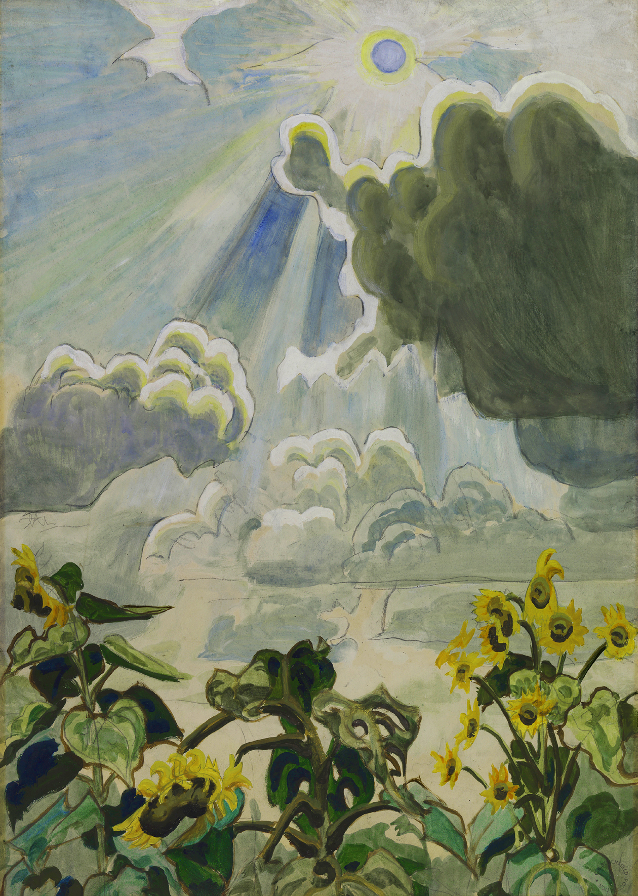
“We come at last to set ourselves face to face with ourselves; expecting that in creatures made after the image of God, we are to find comeliness and completion more exquisite than in the fowls of the air and the things that pass through the paths of the sea” [John Ruskin, Modern Painters, Vol. II, p. 119].

In 1844, John Ruskin, the foremost art critic of the English-speaking world, typified the period with remarks like this. His Modern Painters, underscored and expanded an old notion: “Man is the measure of all things” – true in the time of Protagoras, and true 2,000 years later, in Ruskin’s. The human figure animates a scene – adds scale to landscape, narrative to still-life, and life to monument. A great picture can be any of those things, too, but the human figure shouldn’t be far from the frame.

But flash forward another century, and the picture has changed – radically. By 1944, Clement Greenberg, the Ruskin of his day, was saying things like:

“The avant-garde poet or artist tries in effect to imitate God by creating something valid solely on its own terms, in the way nature itself is valid, in the way a landscape – not its picture – is aesthetically valid; something given, increate, independent of meanings, similar, or originals. Content is to be dissolved so completely into form that the work of art or literature cannot be reduced in whole or in part to anything not itself” [Clement Greenberg: The Collected Essays and Criticism, Vol. I, p. 8].

In other words: if the picture can stand on its own two feet, who needs the human figure? Greenberg kept reviewing, and, occasionally, praising figurative art of the past, but he saw it as a dead-end for the future. Like Ruskin’s a century earlier, his position characterized the period. When the War Department, in 1946, assembled a travelling exhibition of American art to evangelize for American culture behind the Iron Curtain, the show included very little representational art, and almost no figures. The middle of the 20th century would be so dominated by the abstract, and the few major figures to include the human form are often included in the canon as the exception that proves the rule: the de Koonings, the Averys, the occasional Rauschenberg. The world of the future arrived on canvas immediately after World War II, and it was almost entirely uninhabited.

What happened in the intervening century?

A bunch of stuff, really: the rise of the photograph; a shift in art from the objective to the subjective; and a growth of a middle class that needed decoration for their new middle class homes. Dealers and collectors put their chips on abstraction, and museum’s did, too. (The very existence of the Whitney Museum of American art, weirdly, owes something to the fact that the core of its collection was figurative – but that’s a story for another day).

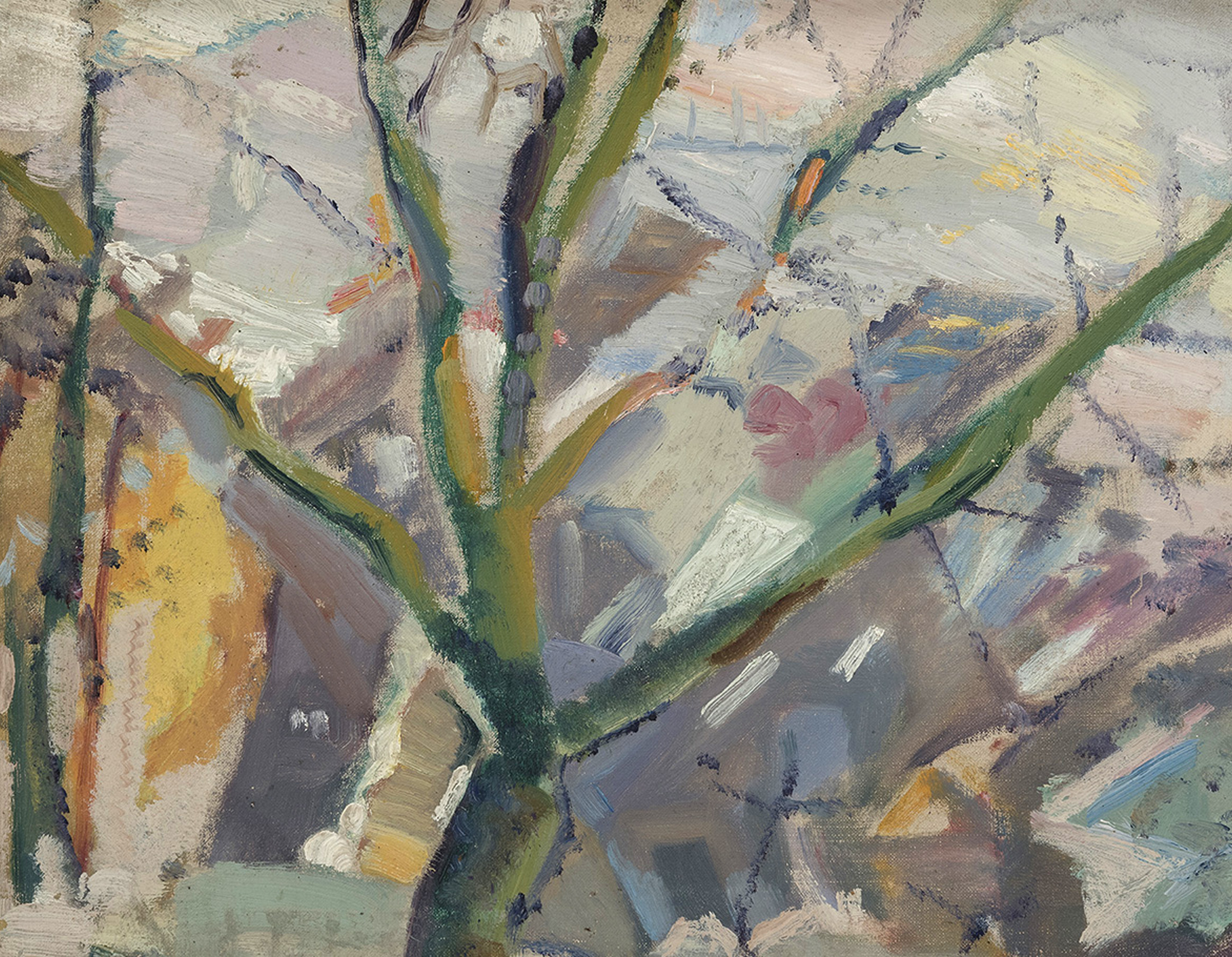
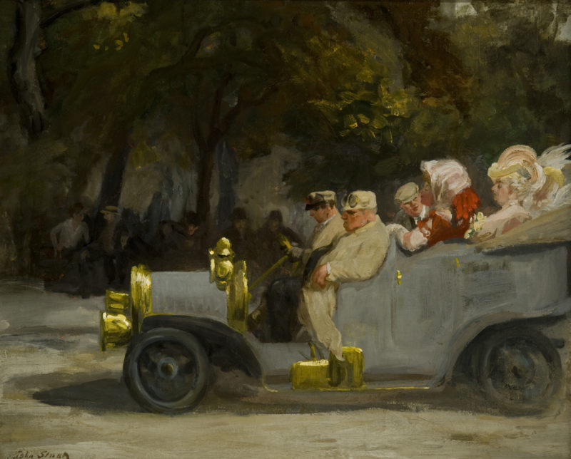
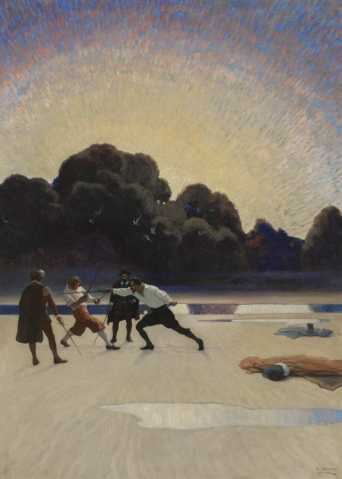
With these, another curious phenomena: the work previously done by fine artists still got done, but now it was done by illustrators. And they did it really well: this in the days before the motion picture, but aided by the tool of the camera. Before the photo magazine (so commonplace today that it’s odd to consider Life and Time had to be invented), but fueled by a ravenous appetite to fill pages. Before the population of the U.S. dwelt mostly in cities, but connected by a robust postal service and home delivery catalogs that made the America a genuinely coast-to-coast readership. Hindsight has called this the Golden Age of Illustration, and it’s easy to see why: Charles Dana Gibson, Howard Pyle, N.C. Wyeth, J.C. Leyendecker—Norman Rockwell is today best known of this bunch, but he’s really just the tail of the beast: in the late 19th century and early 20th, all these artists were household names. The generation that followed looked at them, as Rockwell did, as heroes.

And that’s just the ‘story’ magazines-scrubbers, Harper’s, Collier’s, and the many, many pulps. Newspapers at the time were just as likely to run drawings as photographs. The gang of newspaper illustrators coming out of Philadelphia in the 1890s came to define the early 20th-century style of painting. The gritty urban realism of Everett Shinn, George Bellows, William Glackens and Robert Henri would be known as the Ashcan School.

In 1913, there was an explosion of modernism: a bang that piqued painters and irked presidents: the 1913 armory show. It was the real debut of abstraction in America, with Cubism, Fauvism, Futurism, all on view.

But if something fascinating began in 1913, what was going on right up to that explosion didn’t immediately cease. All those activities that had been the province of these painters—illustration, portraiture, unflinching looks at the real world and gauzy fantasies—all remained their province. The modernists got abstraction, subjectivity, and the illustrators got everything else!

It was a tidy divorce by that metric, but not all the artists saw it that way. Glackens and Shinn very self-consciously pushed their work into realms that they considered unassailably artful: French revival modes that were so distant from illustration that they could escape the growing stain of the term.

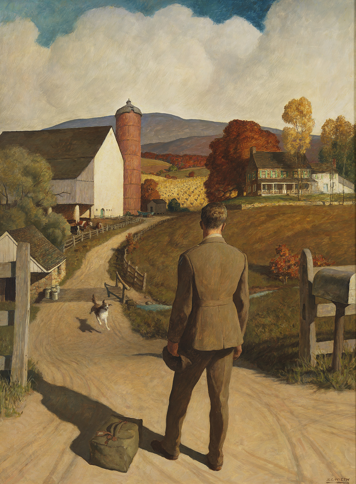
N.C. Wyeth was, by the time of the Armory Show, was America’s favorite illustrator. He was commercially successful from a young age and throughout his career, winning major commissions throughout the Depression. When many of his colleagues joined the WPA to make murals in post offices, Wyeth was getting paid to paint bank lobbies. But more than perhaps anyone, Wyeth embodied the schism between these two camps. He wrote his father,

“I am going to drop illustration. But before, of course, I shall have made all arrangements for a livelihood” (emphasis Wyeth’s).

He went on to describe these arrangements: teach school a few days a week; “living at home and sharing expenses, which of course will make it astonishingly cheaper for [them] to live than it does now” [Betsy James Wyeth (ed.), The Wyeths: The Letters of N. C. Wyeth, (1971), p. 293].

Wyeth wrote this in 1909. He wasn’t able to ever escape illustration – he was working on several compositions for publications even at the time of his death in 1945. But the fissure between ‘Art’ and lowly illustration, in his own head, tormented him for his entire career.

“I know this is so – and all the passive talk about being content with the really-noble-art-of-illustrations-if-you-are-doing-your-best, etc., etc., is emphatically wrong, when day in and day out I feel those insufferable pangs of yearning to express my own life as it is in this beautiful home and these hills . . . One knows then that the divine brush must speak, the one that knows no tricks or receipts, the one that from sheer knowledge can profoundly grasp the truth of the scene with an innocent eye, untainted, undisturbed by the meddling property-man attitude of the dramatic or poetic illustrator!” (emphasis Wyeth’s)[p. 459.].

Wyeth separated out the canvases that were his own, as an artist, and bitterly lamented, for a few years, his years as student to Howard Pyle. And as he struggled, his own children began to win accolades as fine artists themselves. N.C.’s son Andrew debuted a solo exhibition of watercolors, which promptly sold out—and only a few years later he would paint the masterpiece, Christina’s World, that would rapidly join the collection of the Museum of Modern Art—hallowed gates that never opened for N.C.

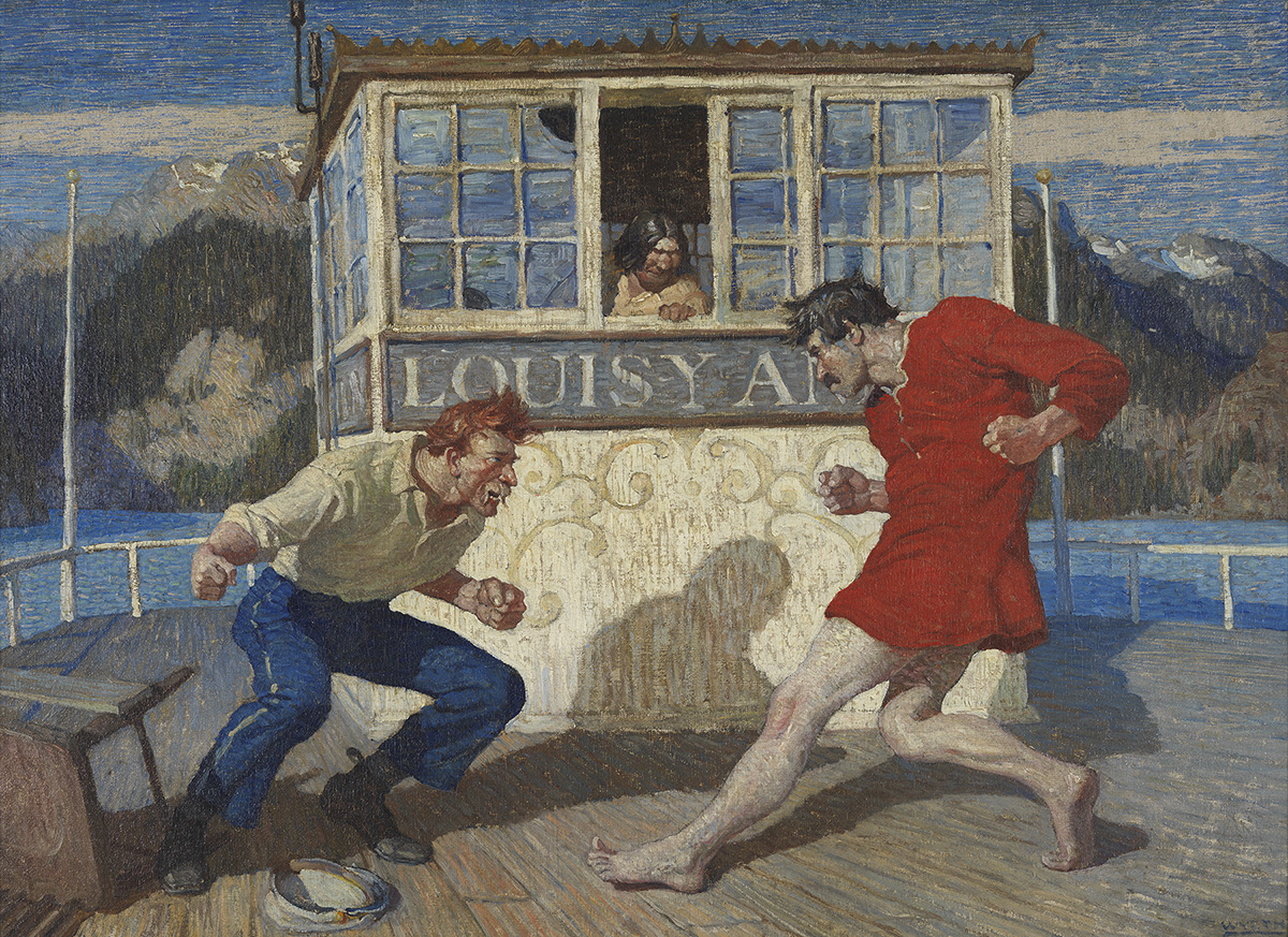
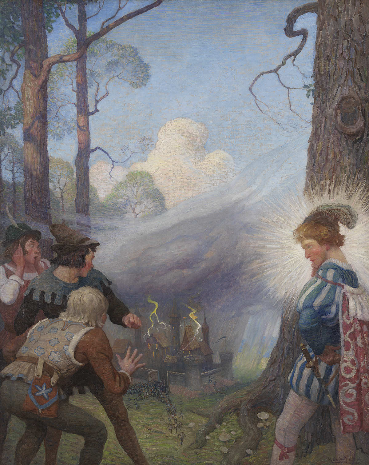
There’s something telling about his continued work as an illustrator. Always a genius for narrative and visual drama, N.C. moved more deeply into his work over time, producing illustrations that elevated the form. There’s a really good reason he was America’s favorite: he was extraordinarily talented, but he also put so much more into his work than many of his contemporaries. In certain cases, he was so pleased with illustrations that replicated his work onto new compositions, solely to be admired as easel paintings — he treated his commercial work as almost a sketch for his fine art work.

And about that “Fine Art”: his works outside commercial illustration are quieter, more thoughtful, more pictorially adventurous – but they’re not Mondrian. His practice remained observational, and the techniques he used weren’t much different from those he bent to his illustration work. So if there was a qualitative difference in his head, on the canvas it was one of degrees.

N.C. Wyeth represents the schism: the illustrator in him hews to the traditional functions of the artist, while the artist inside “feels insufferable pangs of yearning to express” a subjective truth.

He also represents a resolution to that schism—one that has since closed. After Abstract Expressionism gave way to Minimalism, Pop Art and Op Art and The Pictures Generations: Greenberg’s notion that a picture can’t reach outside itself has been utterly dismantled in the past few decades. There’s an essential question soaked deep into Greenberg’s concern that hearkens back to Ruskin as well: What is the appropriate subject for a painting? What are paintings supposed to be about?

Ruskin wrestled with the question, and Greenberg too. Modern Painters went through five volumes, and Ruskin continued to revise these through the 1880s. Greenberg found something to like even in Pop Art. For his part, N.C. Wyeth may have reached as satisfying a conclusion as any. There’s art – drama, comedy, beauty, and sorrow, within his paintings, whether he classed them as illustration or fine art. All are beautifully painted, and, with the hindsight across the vista of the 20th century, it seems hardly to matter whether the subject is a pirate ship or his front yard. The market has come to the same conclusion: an illustration for the cover of the Saturday Evening Post has sold for close to $50,000,000.

Just before his death, N.C. wrote to his son Andrew, to guide him on his own fraught path:

“The greats in all arts have been primarily romanticists and realists (the two cannot be separated). They interpreted life as they saw it, but, “through every line’s being” soaked in the consciousness of an object, one is bound to feel, beside life as it is, the life that ought to be, and it is that that captivates us! All great painting is something that enriches and enhances life, something that makes it higher, wider, and deeper” [February 16, 1944, N.C. Wyeth to Andrew Wyeth].

–Jonathan Spies

Precisionism By The Numbers

It begins, like so many things, with Alfred Stieglitz. Well, you can trace them back further, but various strands of social and political thinking, art-making, and historical conditions began to crystalize around New York’s locus of modernism, the Little Galleries of the Photo Secession. Better known as 291: a numerical gallery for a numerical age. Numbers are important here: those strands of social and political thinking include the strands of the Progressive Era interest in a new urbanism that looked first, second, and last, at numbers. Frederick Winslow Taylor (1856 – 1915) embodied and defined this: a mechanical engineer who stood with a stopwatch on the factory floor at Bethlehem Steel Company, watching workers work—and counting. Work was streamlined into a science of human movement: Taylor broke down each gesture, like Edweard Muybridge series of photographs, and developed what Louis Brandeis coined “scientific management” – but we remember it today as the birth of the Efficiency Movement. Industry was exploding in America, as Europe girded for the first World War – but if the landscape was industrializing, what was even more obvious was that the people were, too. Taylor looked at the shop floor and saw neither machines nor men, but, for the first time, numbers.

And this is what changed, starting around 1910, when Brandeis coined “scientific management”: the key wasn’t industry, but abstraction. Not space-age spirituality, but abstracting from a soot-stained reality to the clean reality of numbers. While “modern art” would debut in full force at the 1913 Armory Show, the change that stole the imagination of the nation had already begun, and it had nothing to do with Cezanne and post-impressionism. This is what spelled the end of the almost vanishingly brief Ash Can movement: the social realists saw a gritty inner city as relevant and real, but Taylor saw a higher ideal: a mechanical sublime. And keep in mind that America was still predominantly a rural nation: the Ashcan School may have tapped a vein in the inner cities, but that wasn’t the American Scene for most of America.

And here another thread comes into play, in the form of the career path of the American artist: the gentlemanly painters of the Hudson River School were often well-born and European-born (like Cole, Moran, and Bierstadt) and set in a Jeffersonian mold: architect, archaeologist, artist, scientist. The Ashcan School were decidedly middle-class professionals, often starting their careers in journalism, in the high narrative mode of Progressive muckrakers like Upton Sinclair and Jacob Riis. Starting around 1910, a new artist-professional class was arising. They started out never as gentleman-farmers nor journalists: they began as designers and architects.

This was the scene, when, in 1911, the architect Oscar Bluemner settled a long-running lawsuit over his design for the Bronx’s Borough Courthouse. Bluemner had been contracted to design the courthouse, which opened in 1914, by a Tammany Hall goon who stiffed the Prussian immigrant for his work a decade earlier. With the small settlement, Bluemner decided to leave the crooked world of architecture for his passion: modernist painting. He wasn’t the first architect-painter in New York City: the Staten-Island born Jasper Cropsey notably designed the elevated train stations that graced 6th Avenue from 1881-1938. Cropsey and Bluemner worked in similar architectural worlds if not styles, designing civic infrastructure as well as rustic country homes. But see the difference that a generation makes in painting: Cropsey’s monomaniacal focus on canvas was the country landscape, depicting more cows than humans by a factor of 100:1. Bluemner, too, placed only a few figures in his works, over three decades of painting. But his pictures had a different subject: the buildings themselves.

Flat Iron.

In the 19th century, American art focused on what America had that Europe didn’t: a sumptuous, Arcadian landscape. But in the early years of the twentieth century, those who were paying attention saw something new on the horizon – something new that Europe didn’t have: a skyline. “I suddenly saw the Flat-Iron Building as I had never seen it before,” Alfred Stieglitz recalled. “It looked, from where I stood, as if it were moving toward me like the bow of a monster ocean steamer, a picture of the new America which was in the making.”


A critical issue that could only plague an artist like Stieglitz: Cropsey loved architecture, but he never painted it. Like the rest of his age, he thought beauty was a property of nature only. Architecture is itself  an art, so why make a picture of a building? Western art is pockmarked with depictions of buildings, but the notion of a building as the subject of a painting, as an artistic expression, is a brand new one. And it must have occurred more readily to Stieglitz, because he was a brand new kind of artist: he was a photographer. From behind the lens, anything that light falls upon is fair game, or so Stieglitz was determining. All the better, in those days of long exposure times, if the subject stands still.

Brooklyn Bridge to Russell’s Corners.

Bluemner wandered the waterways of New Jersey and factories of New York, filling sharp-edged cityscapes with luminous colors. Haunted cityscapes, you might say, but there was a nocturnal romance to his vision. Nocturnal romance could be the heading of a period of the career of Joseph Stella. Stella emigrated in 1896 on the notion he’d follow his older brother into the medical profession, but by 1908 had given up the scalpel for the charcoal, illustrating a survey of the very Bethlehem foundries that Taylor was revamping. The Pittsburgh Survey was classic Progressive Era stuff, complete with photographs by Lewis Hine. The meat of it, tho, was numbers: graphs, charts, maps, and demographic figures. Stella himself saw industrial Pennsylvania as “a Dantesque inferno,” and rendered his views of the hellscape, appropriately, in charcoal. Again, the difference between Stella and the Ashcan artists is instructive: while Everett Shinn produced smoldering charcoals of the railroad [Fig.: 6th Ave. El], Shinn’s was a sinuous form, in line with Honore Daumier (and who could be surprised when he turned, later to a rococo manner a la Fragonard?). Stella was another beast entirely: he allowed the workers to fall entirely out of scale; he used a straight-edge. A series of portraits were included in the survey work, but this was effectively the end of his illustration period. You can see in his Promethean Pittsburgh work that he had already stolen the fire that would light his masterwork, The Brooklyn Bridge.

But we’ll get back to that. Stella wasn’t enough of a team player to genuinely belong to the Stieglitz Circle, but he showed with Stieglitz and knew well the work of Oscar Bluemner, and of Stieglitz’s star John Marin. Marin began his career with etchings mainly of architecture in Europe [Fig. Notre Dame + Brooklyn Bridge] and upon return to New York, began to develop his own quasi-cubist idiom by applying a loosening linear technique to the rising New York Skyline. Marin was fixated on the rising city as few other artists, and he developed his own manner of expressing its rise – linear rather than planar, availing himself of a frenetic energy only rivaled by the Italian Futurists. As Marin was moving from frenetic printmaking to frenetic watercolor, Stella was ending his own short-lived romance with Futurism. And then:

I used as time “the night” which invests every element with poetry. I selected as moods of my symphony the PORT, SKY SCRAPERS, THE BRIDGE and THE WHITE WAY. I placed in the center of my composition the SKY SCRAPERS in the form of a prow of a vessel sailing to the infinite, electricity opening at the base as guide with a pair of wings . . . As a predella to this gigantic steely cathedral I opened the nets of subways and tubes [from a 1944 letter from Joseph Stella, as quoted in American Art in the Newark Museum: Paintings, Drawings, and Sculpture (1981), p. 42].

Stella’s words echo Stieglitz’s 1903 observations of the Flatiron, but add a Gothic Romance. Stella rendered the “gigantic steely . . . tubes” with sharp-edges and a shiny surface. A treatment not unlike that which Fernand Leger would develop in the 1920s – but applied to a dreamlike urban space of feverish intensity.

The five-panels of Stella’s Voice of the City of New York Interpreted pictures this gothic Cathedral, presenting it in the format of a medieval devotional polyptych. When Georgia O’Keeffe attempted similar subjects between 1925 and 1929, she achieved a similar dreamlike effect. Her narrow vertical canvases echoed Stella’s format, and O’Keeffe’s skyscrapers prefigure her later series of crosses in New Mexico.

George Ault was absorbed by the city in just the same moment as O’Keeffe and Stella, but his dream-scapes were decidedly cooler, calling the city “the Inferno without the fire.” A cooler palette didn’t mean a less haunted space, and Ault’s hard-edged urbanism developed into his own personal surrealism by the end of his career. This surrealist quality was expanded upon by Franciss Criss in the 1930s, and in the pre-war city scapes of Theodore Roszak – but the thread of fever-dream anxiety gave way to a different kind of industrial vision in the years leading up to the World War II.

Precisely Pop.

In the mid-1910s, Alfred Stieglitz began publishing a large format magazine to focus on the modernists that he found himself in the midst of. His first publishing venture was named after his chosen medium and the circle around him at the turn of the century – Camera Work – but by 1915, his gallery had become ground zero for modern art in all media. The first issue of the magazine named for the gallery – a numerical magazine for a numerical gallery: 291 – was covered with a portrait of Alfred Stieglitz by Francis Picabia. Picabia presented the impresario as a camera – vaguely anthropomorphic but entirely mechanical. Picabia’s portrais (he also did Paul Haviland and Marius de Zayas as spark plugs) was joined the next year by Morton Schomberg’s ultimate statement on the theme: a big of plumbing attached to a miter box, which he called God. The new deity was shiny, metal, impersonal, and industrially-designed.

Add to this another quality: commercially available. What god couldn’t create in a week, America churned out on assembly lines. Gerald Murphy celebrated these with his short career: the safety match. And, with perhaps a nod back to Taylor, a vision of the pocketwatch. A portrait of man as a camera, a sparkplug—or the very timekeeping device by which he is measured. Murphy gave up painting after a few years to run – what else? – a very efficient leather good manufacturer. Murphy engineered one of the earliest examples of product placement in a film when his friend Alfred Hitchcock agreed to place one of his firm’s handbags in the arms of Grace Kelly in Rear Window.

That sounds like a digression, but it’s really the theme: this is the birth of the brand logo. Charles Demuth opened the world of branding to fine art with Figure 5 in Gold, and years later Stuart Davis brought the sharp-edge treatment of brands as a subject in themselves. Davis considered the explosive power of capitalism with a wary Marxist critique, and depicted carefully the modern temple of consumerism: the supermarket. Charles Demuth alluded to the other end of the Biblical subject by naming his precisionist masterpiece My Egypt – a land of bondage and captivity, embodied by a shiny Lancaster factory.

Another element of Stuart Davis’s political convictions was a commitment to a certain international solidarity. In this regard, Precisionism joined an international movement of celebration of industry in a perfectly secular manner. The hard-edged style would find expression in abstraction as well, but the figurative subjects of industry, both urban and rural, can be found across America and beyond.

Ralston Crawford’s work began in just that manner: a secular celebration of rural industry. Demuth and Sheeler both made dramatic renderings of barns and grain elevators, and Crawford, younger but still early enough to join the party in the pre-WWII years, created some of the most lasting images in the Precisionist movement. Shiny steel; unpeople landscapes; sharp edges and blue skys. For the first time, the WPA overpasses and bridges that were snaking across America were their own subject matter, the source of civic pride in addition to good construction jobs as America dug out from the depression. How distant this artform is from a generation earlier! Ralston Crawford’s cheery evocation of freshly-poured concrete in Maitland Bridge compared to Everett Shinn’s pictures of breadlines. But Crawford’s sunny disposition didn’t survive the war. In addition to observing the bombed-out European cities, he was the sole artist to witness the testing of atomic weapons in the South Pacific after the war. This fractured not only the clean lines and flat planes of color with which he had worked for a decade, but also shook him from the shiny, new, and fabricated. Now he turned his canvas, and increasingly, his camera, to scenes of destruction and decay: scrap-yards, bomb-sites, and cemeteries.

Which perhaps properly concludes the arc of this uniquely American artform: the rise and fall of an industrial American scene, that celebrated the art of architects and designers with paintings that filled straight-edged geometric shapes with planes of pure, optimistic color. By the early 1960s, Stuart Davis – a painter who had shown at the 1913 Armory Show and was in the room when the term “Ashcan” was coined – looked out at a country turned upside down. One of his final paintings, Anyside, holds on to some of the pictorial devices of Precisionism, but the subject matter is more difficult to make out. It is a simplification of a painting by Glenn O. Coleman, from 1926, Downtown Street. Downtown Street takes as its subject the very elevated train station designed by Jasper Cropsey in the 1870s – but surrounded now by sagging tenement buildings. Davis for his part, took the scene and distilled it into clean planes of Christmas-y red and greens. But the scene is entirely obscured in Davis’s sketches: the people are reduced to strange squiggles, the subway station become a simple black-and-white grid – and the entire composition has been turned upside down. Looking back across the heart of a century of industrialization, modernization, and disintegration, Davis’s final remarks were ambivalent about progress.

angles